






 Mediterranean Skin Rituals
The shape of slow.
A Mediterranean body-care concept shaped by light, touch, and the quiet pleasure of everyday rituals.
An independent brand concept by GalyamStudio.
What if daily care had a slower rhythm?
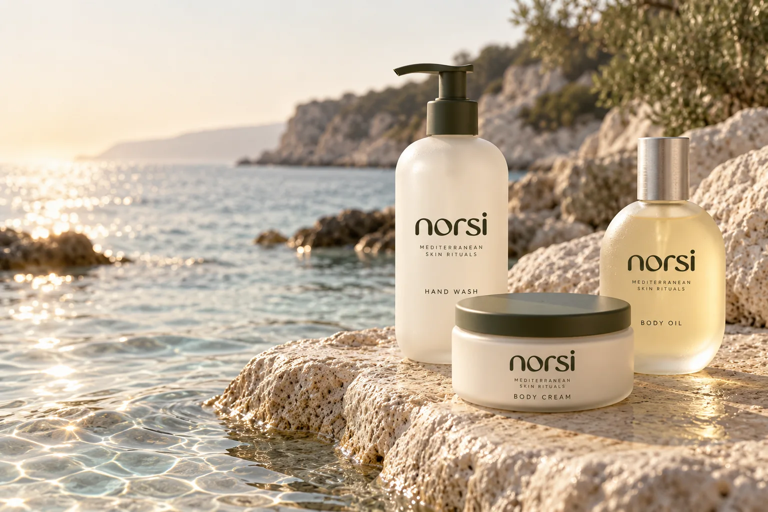
We imagined NORSI as a body-care brand that makes room for a brief pause. A familiar gesture becomes more considered through the feel of a bottle, the clarity of a label, and the atmosphere surrounding it.
The Mediterranean gave us a visual vocabulary: softened stone, filtered light, olive tones, and water in motion. We translated those impressions into a contemporary identity with warmth and restraint.
Sensory
Begin with how the brand feels.
Considered
Give every detail a clear purpose.
Personal
Make the everyday ritual feel your own.
A softer signature.
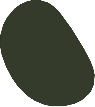
The lowercase wordmark gives NORSI an approachable, tactile character. Rounded forms create continuity, while the irregular shape inside the “o” introduces a distinctive point of recognition.
That small detail becomes the starting point for a wider visual language.
One shape. A complete language.
An organic form expands into a flexible family of contours, crops, and impressions. It can hold an image, move across a surface, or appear quietly as an emboss.
The result connects the identity across packaging, print, and space.
A palette you can almost touch.
Chalk creates breathing room. Olive brings depth. Ink sharpens the details, while sage adds a softer transition. Brushed metal and frosted glass introduce a cooler counterpoint.
- 01 / Chalk
#F3F0E7 - 02 / Olive
#343B2B - 03 / Ink
#20211D - 04 / Sage
#A8AD9A
Digital presentation colors; not production print specifications.
Frosted glassSoft light. Quiet translucency.
Textured paperA surface with presence.
Brushed metalA precise, cool contrast.

Three gestures. One daily ritual.
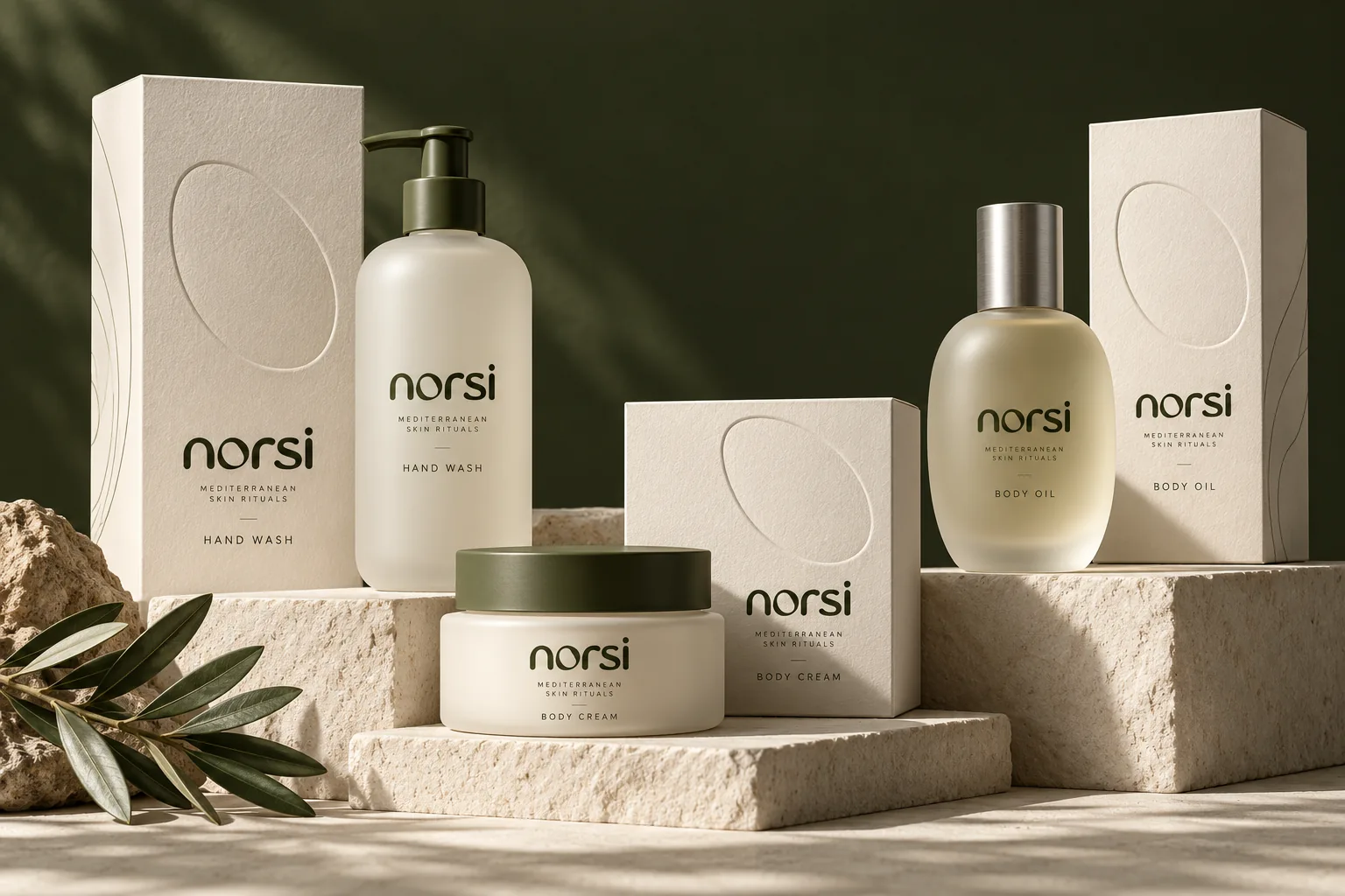
The concept begins with three familiar products, brought together through a consistent visual system.
Hand Wash
The ritual begins with water.
Body Cream
A moment of care, held in your hands.
Body Oil
A final gesture. A slower finish.
Rounded vessels echo the wordmark. Restrained labels keep the hierarchy clear. Across the cartons, the signature form becomes a tactile detail.
The ritual begins before the first touch.
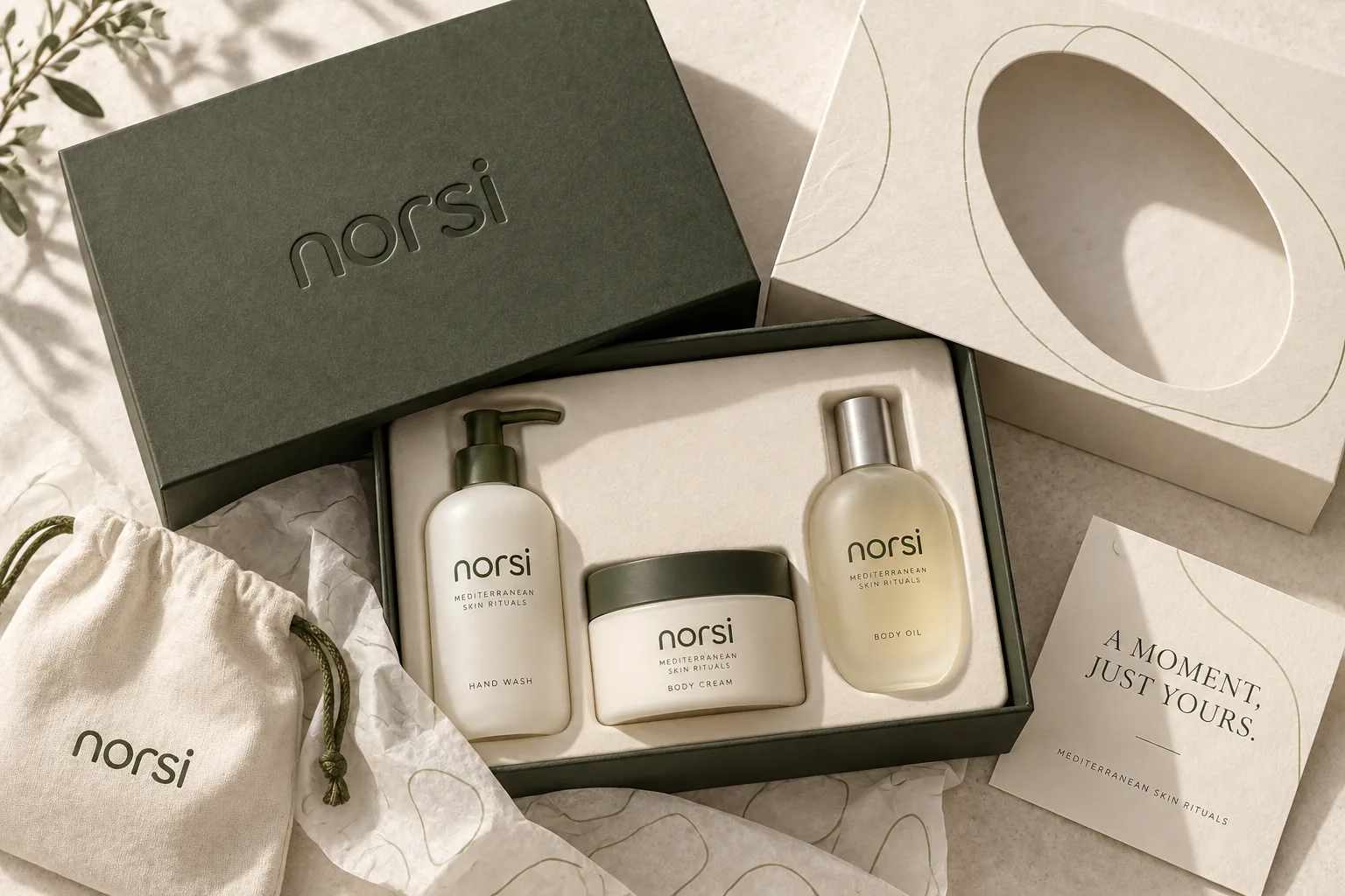
The gift experience extends the identity through an olive outer box, a sculptural sleeve, and a carefully arranged interior. Tissue, fabric, and a simple message make the opening feel considered.
A moment, just yours.
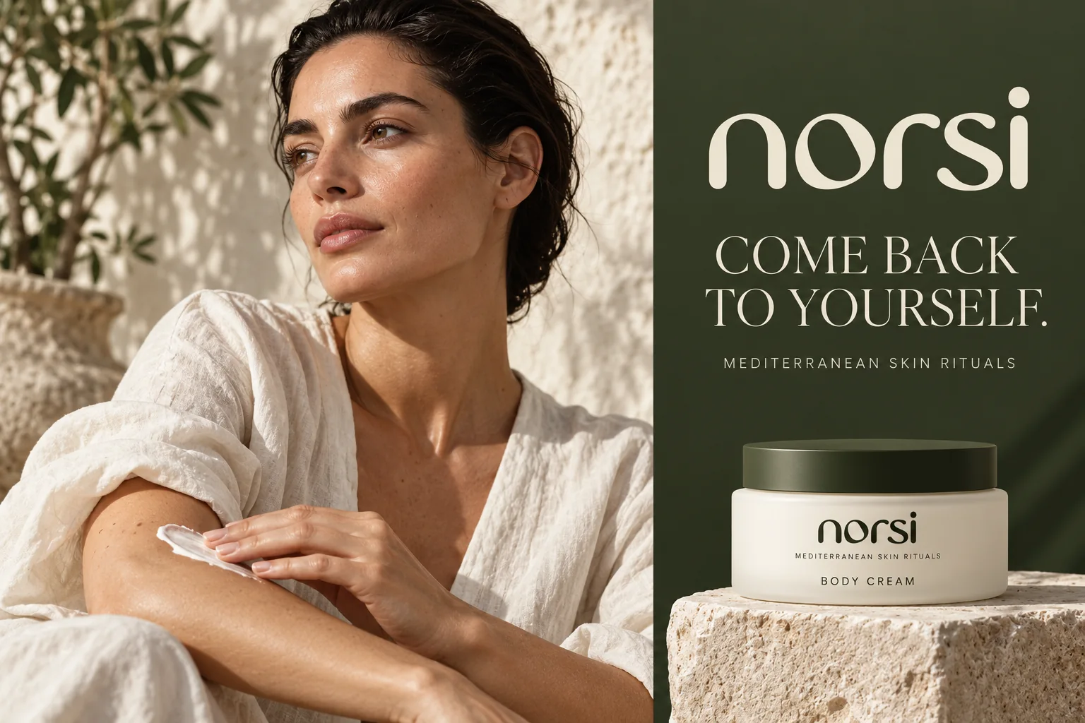
Come back to yourself.
The campaign brings the brand into a human moment. Natural skin texture, daylight, and an unhurried gesture express the same softness found in the identity.
The tone is intimate and assured, with space for the person using the product.
A world beyond the bottle.
The same vocabulary carries into the retail concept: mineral surfaces, olive backdrops, brushed metal, and measured light. Signage, bags, and display objects belong to the same family.
This is where a visual identity becomes a place.
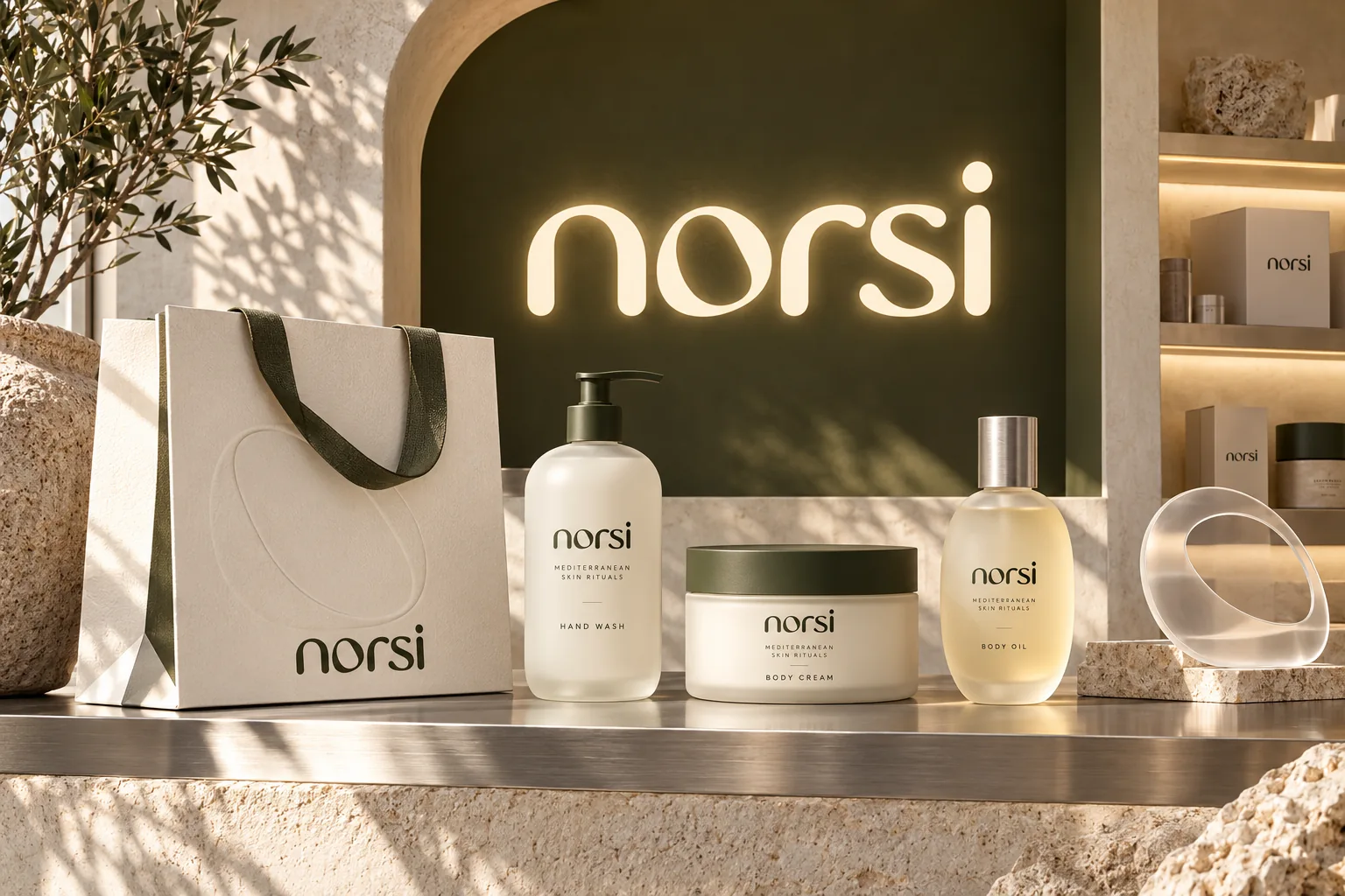
A proposed retail environment, not an existing store.
From a single letter to a complete brand world.
NORSI brings strategy, identity, packaging, and art direction into one coherent expression. Every element returns to the same idea: making room for a more considered daily ritual.
Concept, brand identity, packaging design, and art direction by GalyamStudio.
Self-initiated concept project. Product, campaign, and retail visuals are conceptual.
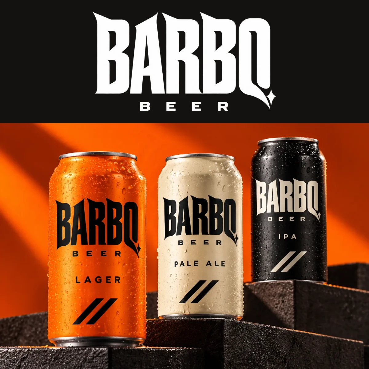
אילו היינו ממתגים בירה, כך היינו עושים את זה. קונספט מיתוג עצמאי של גל ים סטודיו: זהות חזותית, אריזות ושפה פרסומית ל־BARBQ.
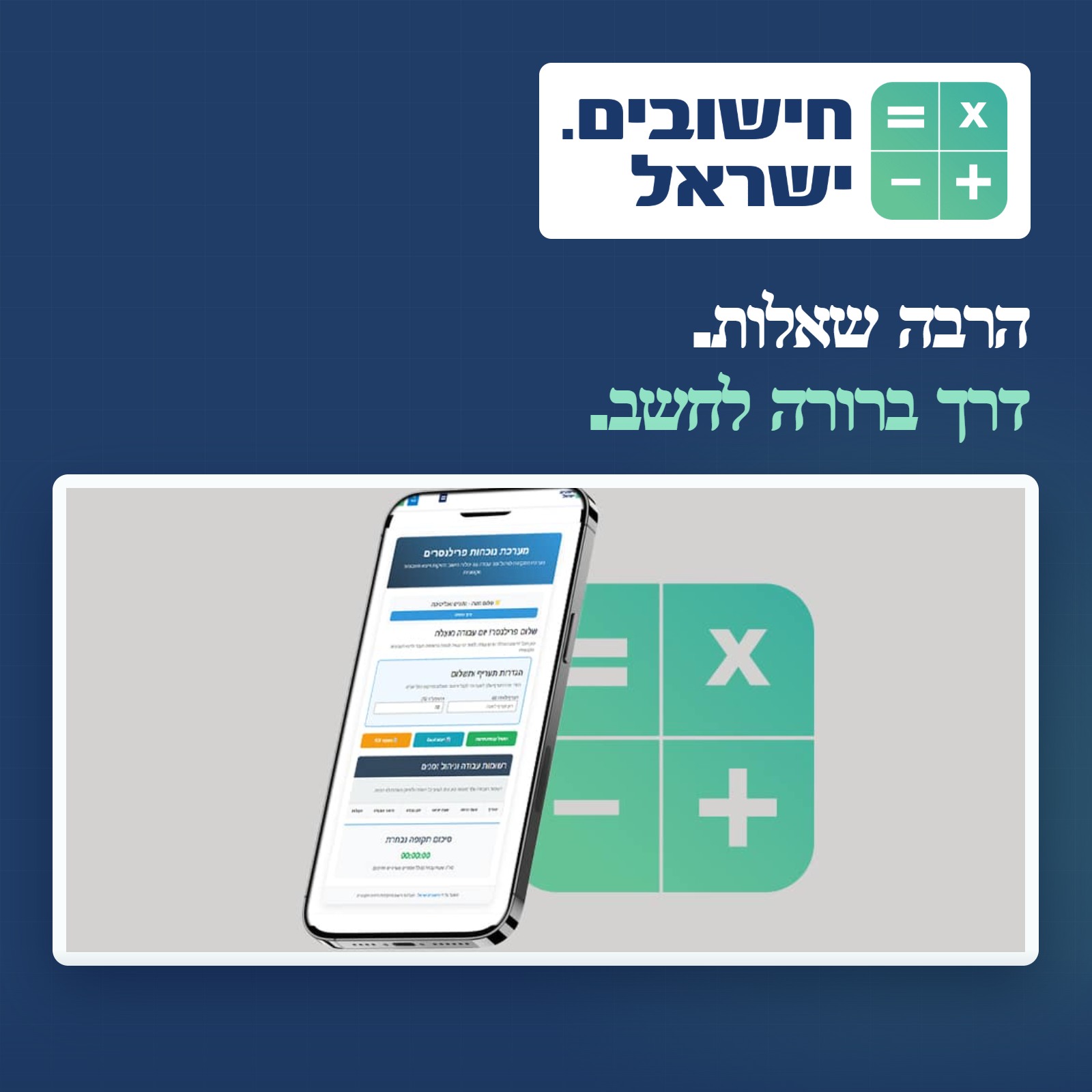
אפיון, עיצוב ופיתוח חישובים.ישראל — אתר כלים ומחשבונים שמארגן תחומים מגוונים ומציג חישוב ברור גם בנייד.
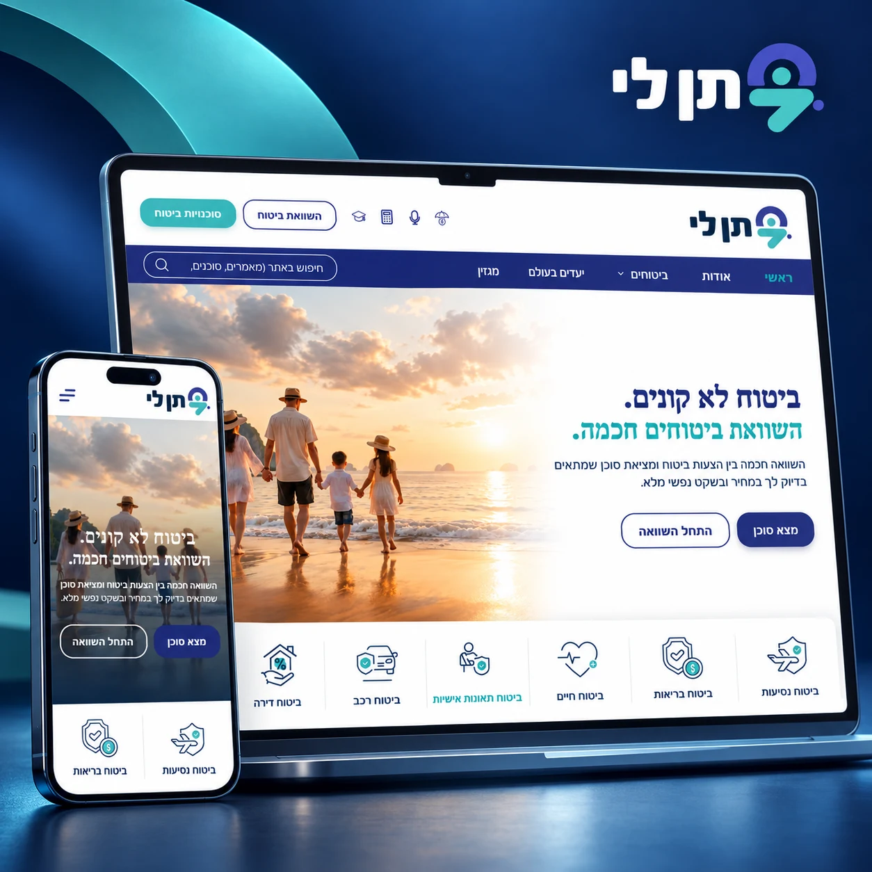
מיתוג מחדש, אפיון ופיתוח פורטל ביטוח רחב: השוואת ביטוחים, אינדקס סוכנים, תוכן וכלים דיגיטליים — בחוויה אחידה ונגישה.